
How to make a wireframe
Learn how to make a wireframe: order the blocks, write real headings, mark images and actions, test the page and build one from a free template.
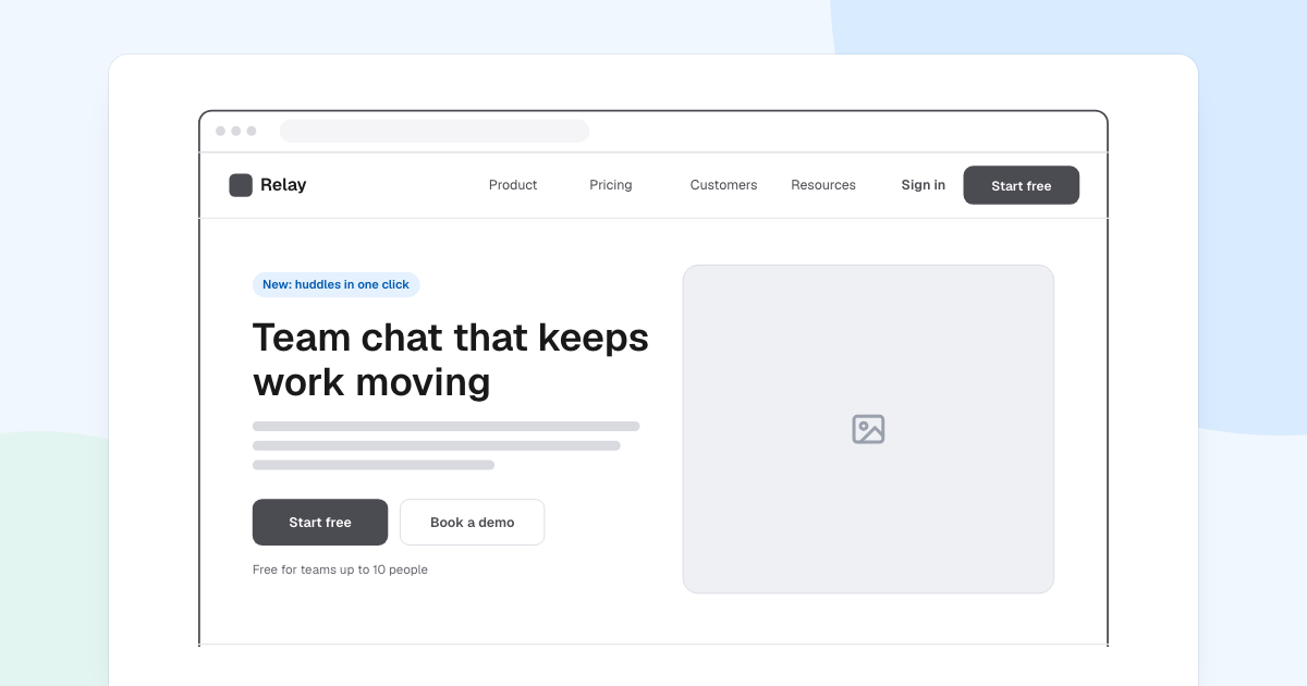
A wireframe is the cheapest version of a page: blocks and words, no colour. People can argue about order and message while a change still takes a minute. Here is how to make a wireframe, using a landing page for Relay, a team chat tool.
Quick AnswerA wireframe is a simple plan of a page that shows its structure and message without visual design. To make one, write the page’s job, put the blocks in order, write real headings, mark images and actions with placeholders, then test it on someone new.
What is a wireframe?
It is a plan of a page, not a picture of it. Each mark stands for something the design fills in later.
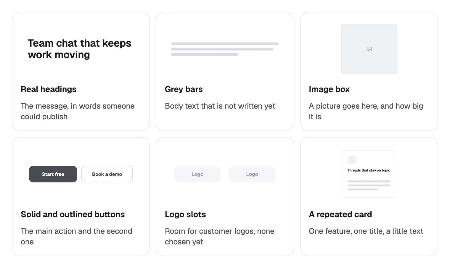
Use one when the content or its order is still open. Skip it when you are only restyling a page that already works.
Wireframe, mockup or prototype?
The three answer different questions, and each costs more to change than the one before.
| Stage | What it shows | What it answers |
|---|---|---|
| Wireframe | Structure and message | Is this the right content, in order? |
| Mockup | Colour, type and images | Does it look right? |
| Prototype | What happens when you click | Can people use it? |
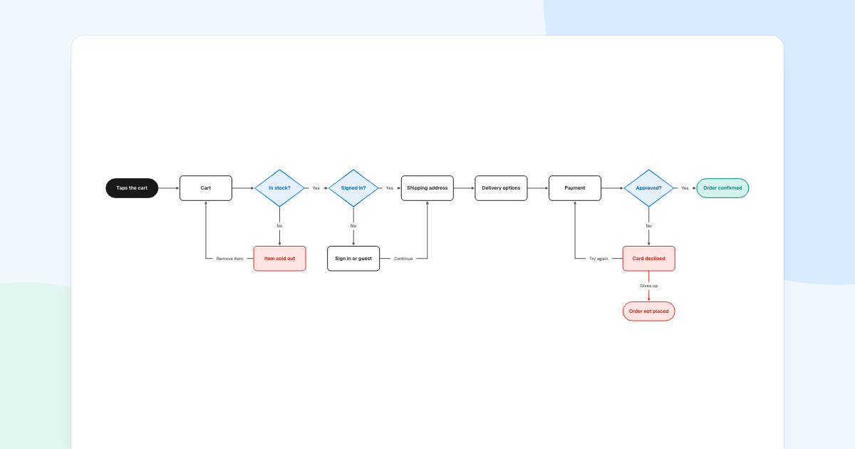
If several screens are involved, draw a user flow first, then wireframe the screens it names.
How to make a wireframe
Write down the page’s job
Use one sentence. Relay’s page has one job: get a team to “Start free”, with “Book a demo” as the second choice. Any block that does not help with that has to justify its place.
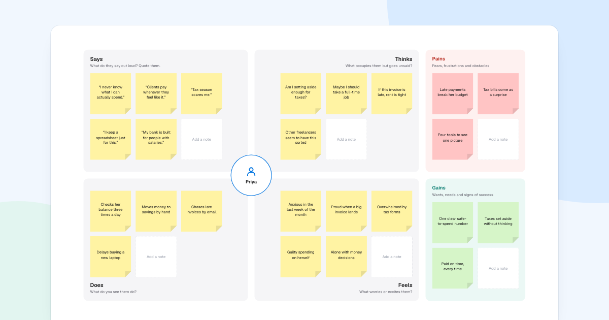
If you do not know what visitors worry about, find out first. An empathy map is a quick way to collect it.
Order the blocks
List what a visitor needs to learn, in the order they need it, and give each point a block. Draw them as empty boxes first.
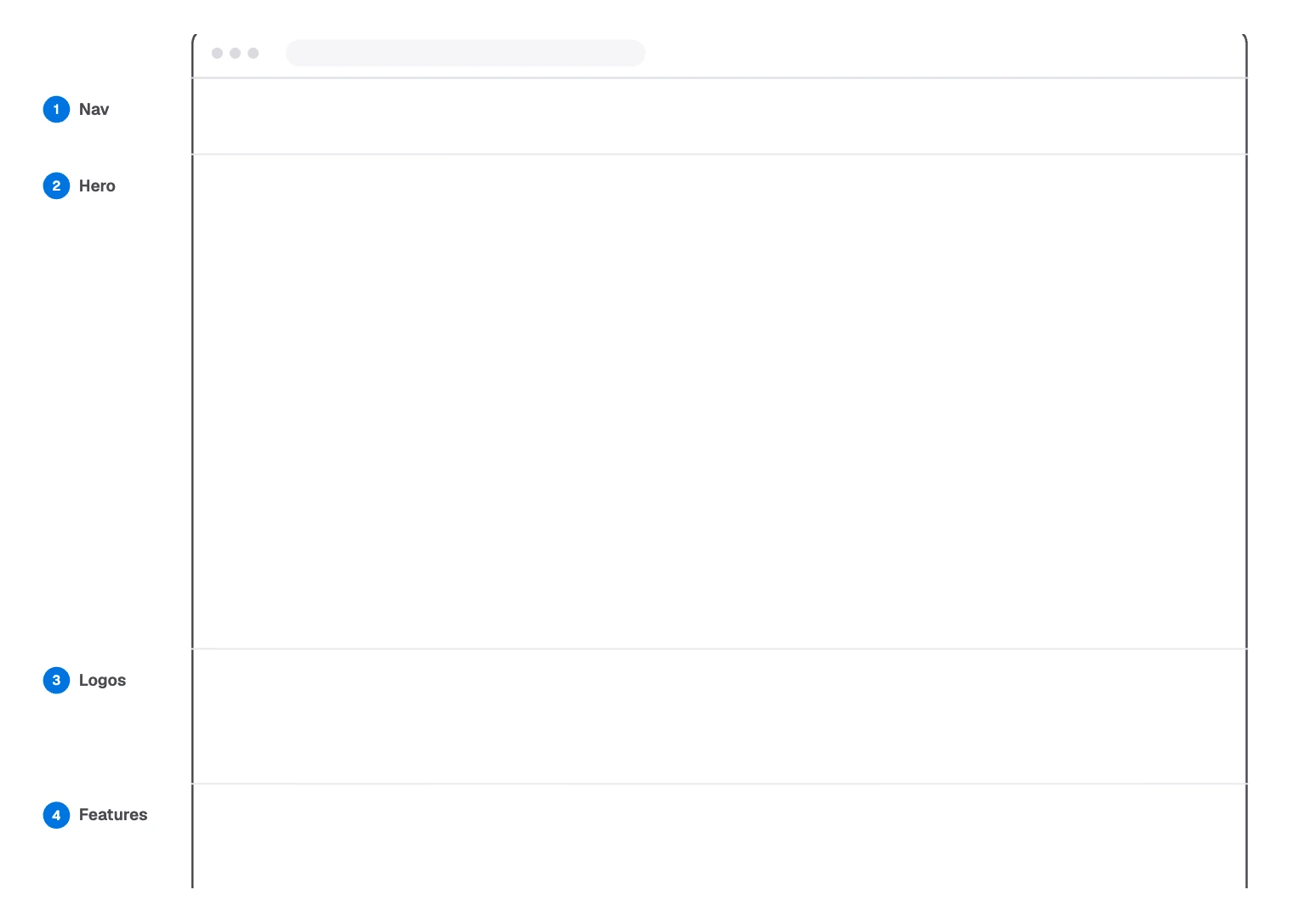
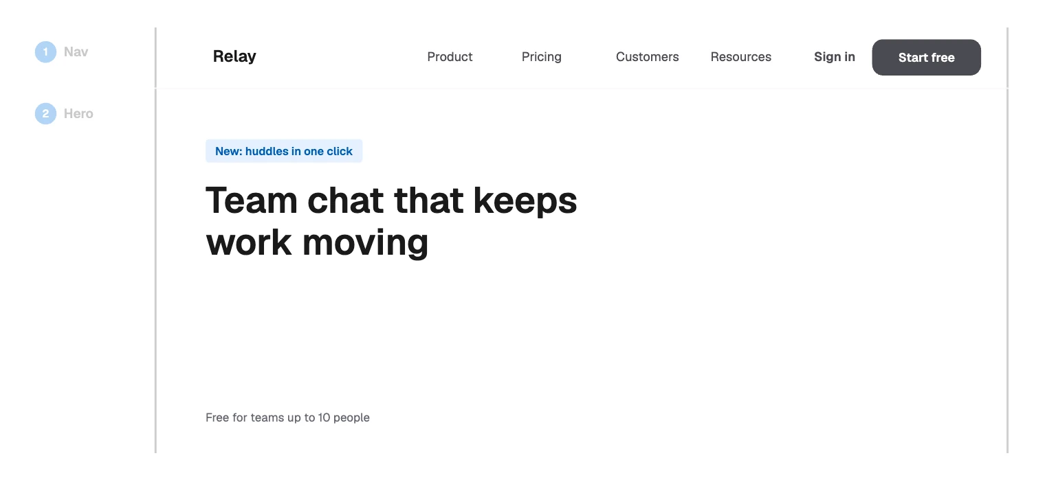
Relay’s page runs Nav, Hero, Logos and Features, then Testimonial, Pricing, FAQ and Footer. Block size is a decision too: the hero takes the most room because most of the message is there.
Write real headings
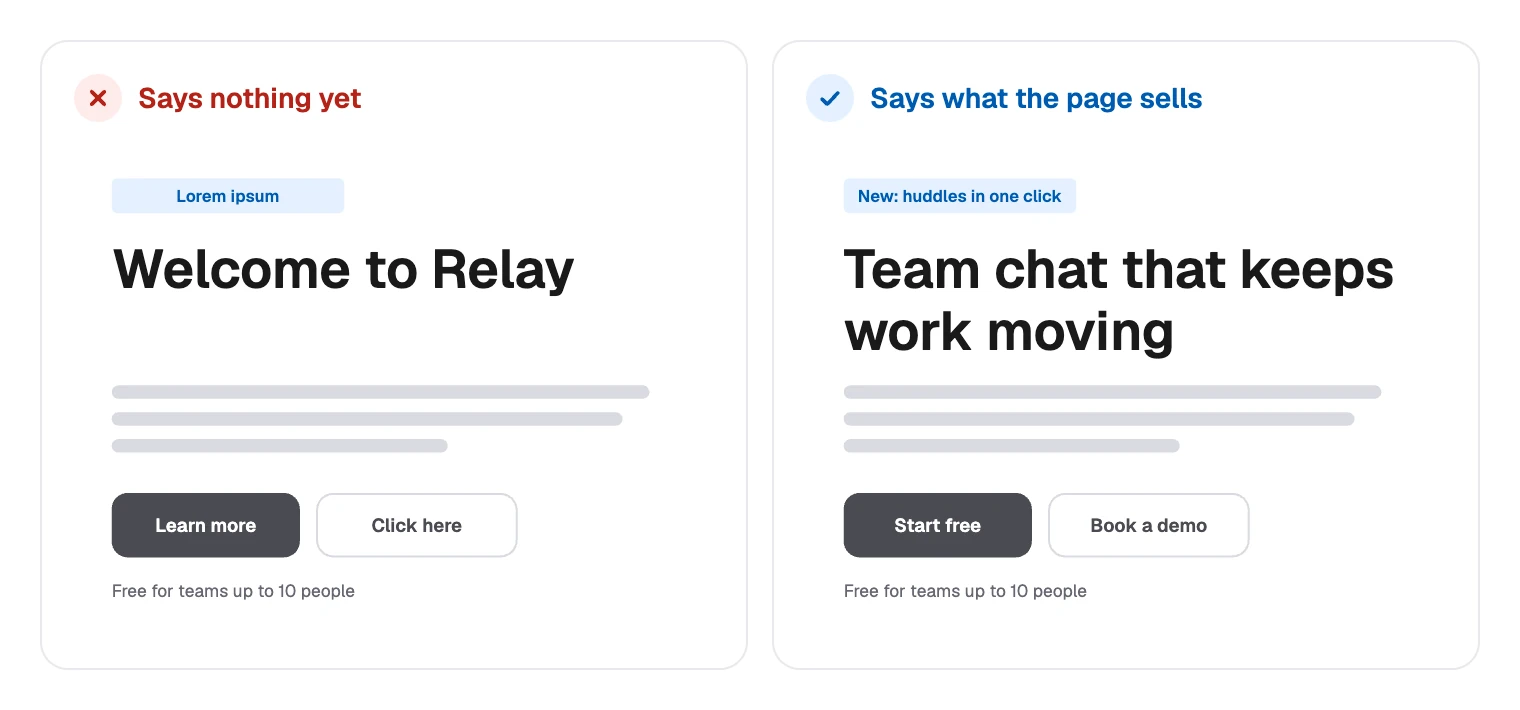
Headings carry the message, so write them now, along with buttons and menu items. They do not have to be final, only true.
Filler hides the question you came to answer. Nobody can disagree with “Welcome to Relay”.
Mark images and actions
Everything else stays a placeholder, drawn at the size it will take.
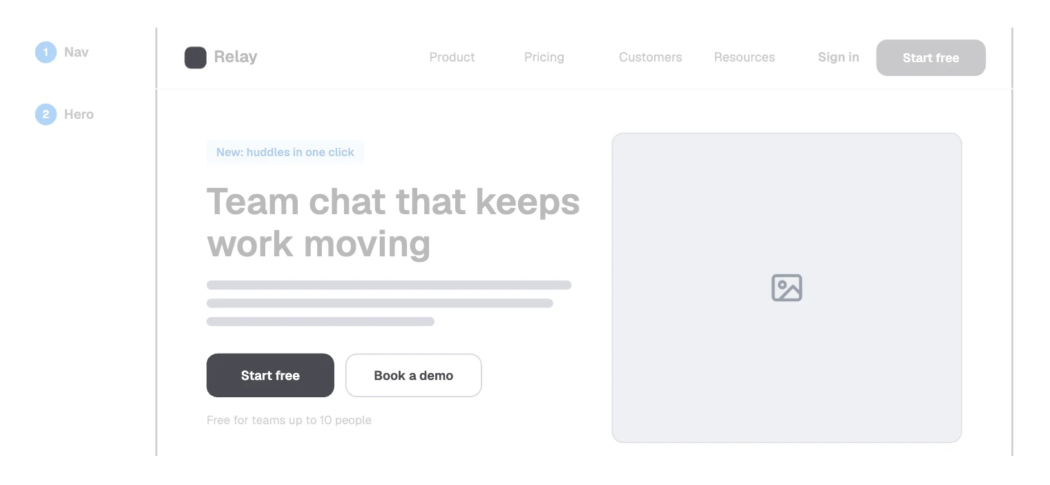
- Grey bars show roughly how much text goes there.
- An image box holds the space and says a picture belongs in it.
- One solid button per block marks the main action. Anything else is outlined.
The rest of the page follows the same rules:
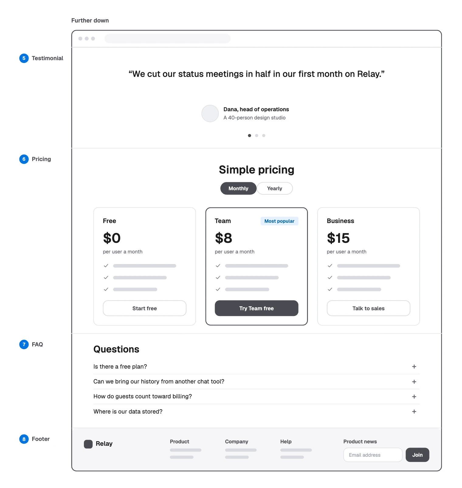
Write the questions you really get. “How do guests count toward billing?” tells the team something a grey bar would hide. So does the “Most popular” tag on Team, which is a pricing decision worth having now.
Test it on someone new
Show it to someone who has not seen it, and ask what the page offers and what they would do next. If they cannot say, change the words before you touch the layout.
Making a wireframe in FlowDraw
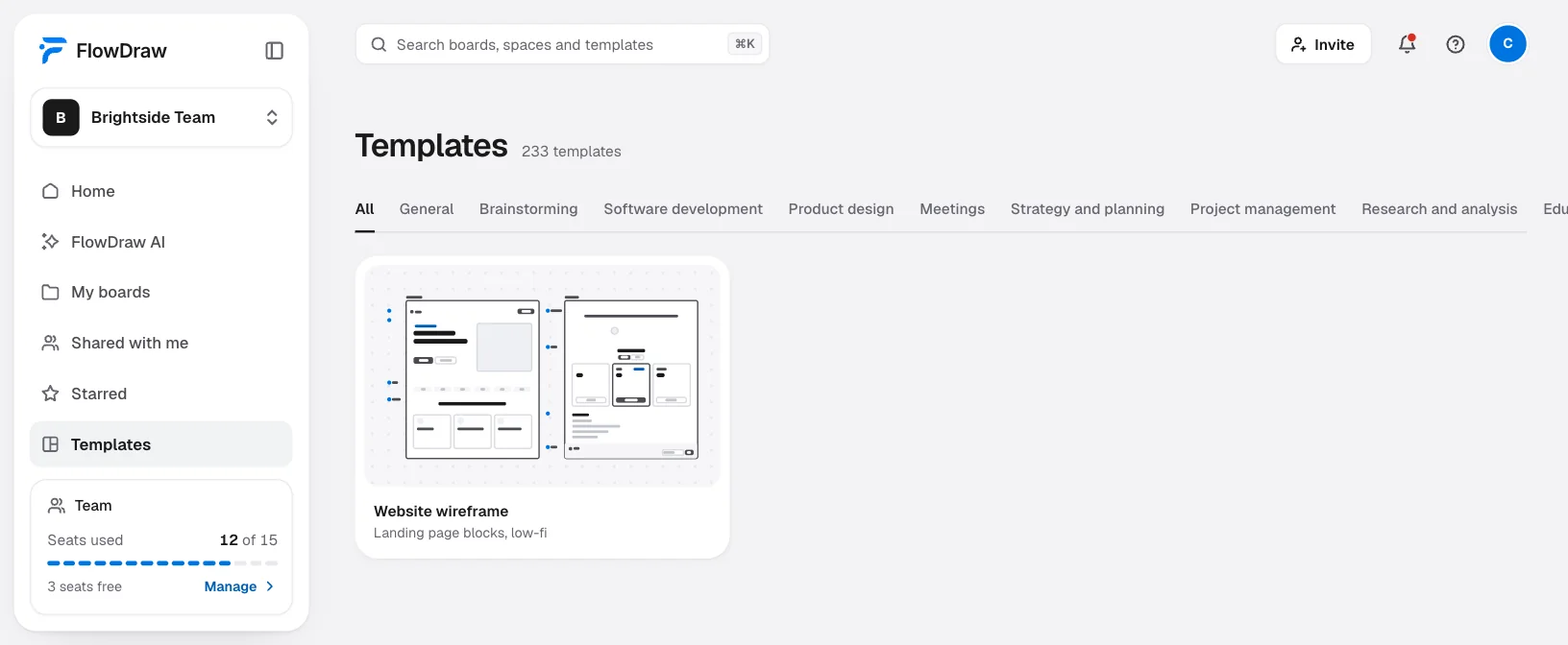
“Website wireframe” is a free template in the Product design category, with both halves of the Relay page. It is also larger than a Free board allows: 161 elements against 150.
Open the template
Search for “Website wireframe” under “Templates”, open the card, then choose “Use template”.
Make room if you are on Free
You can retype, move and delete as usual, but nothing that adds elements goes through. Deleting the FAQ block and its label, 14 elements, leaves 147. Pro and Team have no limit.
Change the words
Double-click a heading, button or menu item, then type. Press Esc to finish.
Move a block
Shift-click its parts, press ⌘G (Ctrl+G on Windows) to group them, then drag. For a large block, drag a box from the margin instead, then Shift-click the browser outline to drop it.
Move a divider
The lines between blocks are attached to the browser outline. Drag each end to the new height.
Repeat a part
Select or group a feature card and press ⌘D (Ctrl+D on Windows). Drag the copy into line.
Say where buttons lead
FlowDraw has no way to add a link to a shape, so a board does not click through. Press Esc, then C, and write the destination in a comment.
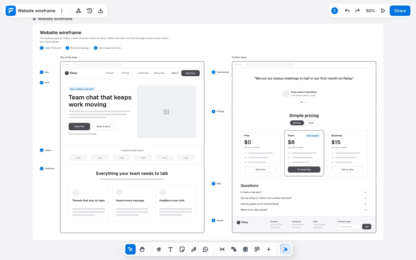
For review, choose “Share” and add people. On Free everyone you invite can edit; on Pro only one person can, so others comment. “Mobile app wireframe” is the phone-sized template, and at 144 elements it fits a Free board.
A template is only a first draft of the page’s structure, so change what does not fit rather than filling in every block.
Wireframe mistakes to avoid
- Designing too early. Colours and fonts turn a talk about content into a talk about taste.
- Filler headings. Lorem ipsum hides whether the page says anything.
- Writing all the body text. Grey bars are enough until the order is settled.
- Two main actions in one block. If both buttons are solid, you have not decided.
- Wide screens only. Stack the blocks in a narrow box to see what a phone shows first.
- Polishing a wireframe. Once people praise how it looks, it has stopped being cheap to change.
FAQ
It settles what a page contains, in what order and what it says, before anyone spends time on visual design. Because it is quick to change, people suggest bigger changes.